Personal Project
Date: December 2025
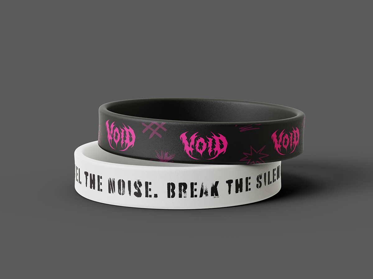
Deliverables: Logo, Packaging, Advertisements, Merchandise
Role: Primary Graphic Designer
Scope: Brand Identity, Package Design, Advertising and Marketing, Merchandise Design
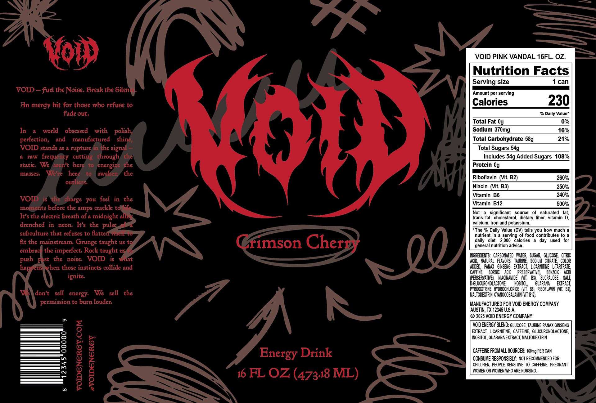
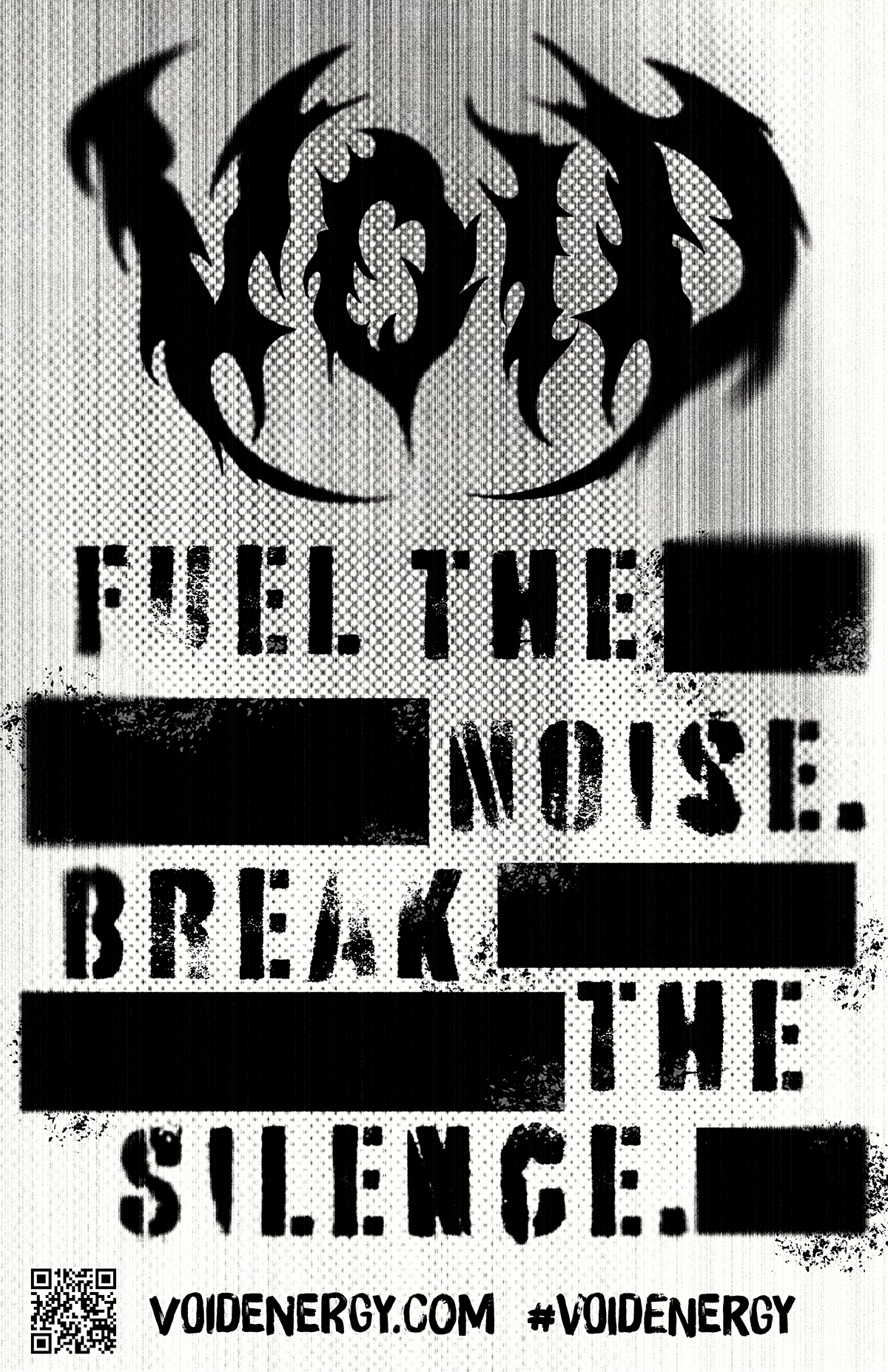
VOID Energy is an unapologetically bold energy drink brand built for the rebellious, the restless, and the creatively defiant. It’s designed for those who reject the mainstream and thrive on individuality, people who find their identity in underground music scenes, late-night jam sessions, and the raw, unfiltered energy of self-expression. Rooted deeply in grunge aesthetics and hardcore metal culture, VOID Energy embraces a dark, edgy visual identity paired with an attitude that challenges conformity.
VOID Energy positions itself as fuel for those who push boundaries. Whether on stage, in the studio, or in everyday life. It’s not about fitting in; it’s about standing out, turning up the volume, and embracing the void. My job is to create this brand from the ground up and give them a visual identity that fits their product.
Process


Final Designs


Mockups


Reflection
This project was genuinely enjoyable, as it allowed me to explore a design style I had never worked with before. I had a great time experimenting with various grungy advertising layouts and incorporating a graffiti-inspired aesthetic into the backgrounds of my can labels. Throughout the process, I gained a deeper understanding of how to execute this style effectively, balancing texture, contrast, and visual intensity without overwhelming the overall composition. I also feel that I maintained strong brand consistency across all deliverables, ensuring that each piece aligned with the identity and attitude of the brand I created. Overall, the project was both creatively rewarding and a valuable learning experience.