For this project, I was tasked with redesigning the packaging of a product of my choice. The spin on this was that we had to make a design that was type focused and weren't allowed to use much imagery. I chose the tea brand, Traditional Medicinals. My main goal for this assignment was to create something earthy, soft, and visually appealing while also displaying its information effectively.
Research & Discovery
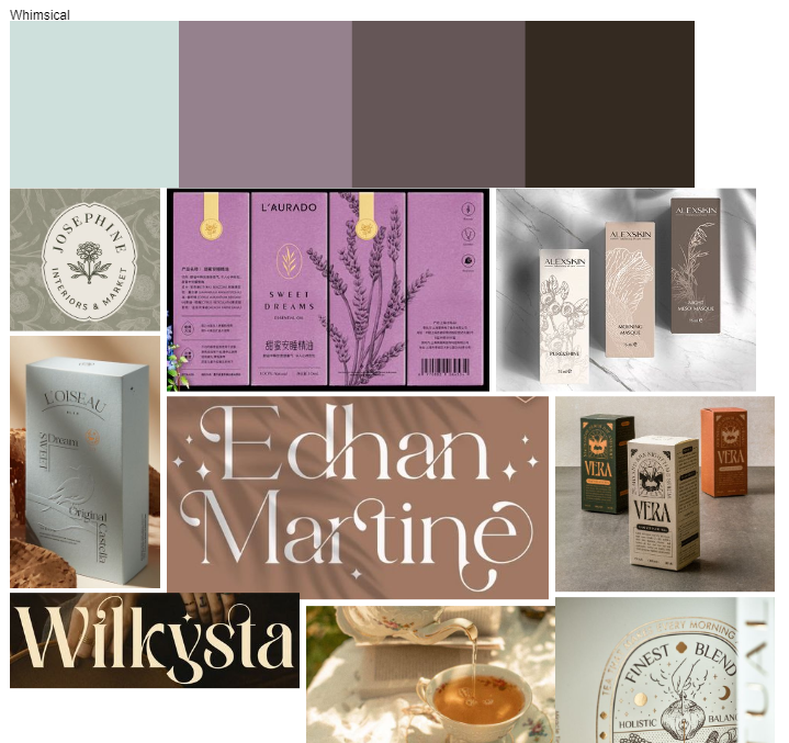
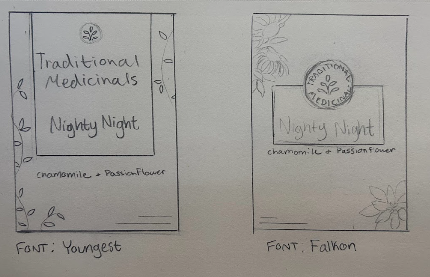
Traditional Medicinals is a well-established herbal wellness company founded in 1974 in Northern California by herbalists Drake Sadler and Rosemary Gladstar. Over its 50+ year history, the brand has become a leader in the botanical tea space, known for blending traditional herbal knowledge with rigorous scientific quality control.
They strive to create a positive impact and to prioritize people, their products, and their planet over profit. At Traditional Medicinals, their quality management and control systems encompass each herb at every step of its journey. They believe that it is their responsibility to preserve Earth's ecosystems.
The original packaging uses a natural, wellness-oriented design style that combines detailed botanical illustrations with clean, modern branding. I felt that the original design was too busy and overwhelming for the average consumer, so for my redesign, I aimed to move toward a softer, more gentle aesthetic that feels calmer and more approachable than the original.
Creative Brief
In my creative brief, I outlined three main objectives for this redesign: to make the visual experience more pleasing, to distinguish it from its competitors, and to present important information in a way that feels clear and approachable rather than overwhelming.
Mood Boards
For my moodboards, I wanted to explore three distinct styles while keeping everything soft and comforting. The first has an earthy, plant-focused aesthetic; the second leans into a whimsical, ethereal, dreamlike feel; and the third embraces a modern, minimalist look with clean, straightforward design. In the end, I feel that I grabbed bits and pieces from each to inspire me during the design process.
Type Exploration
During my type exploration, I focused on selecting fonts that felt unique and dreamy while still remaining clean and readable. I ended up really liking the options shown above.
Concept Development
Here are a few of my original concept sketches, from which I selected three to develop into digital drafts.
Digital Drafts
During the digital drafts, I began to get a clearer sense of each design direction, but I still wasn’t confident committing to just one. I loved the color palette of the first concept, the layout of the second, and the primary type choice in the third. After a lot of consideration, I decided to combine the strongest elements from each draft—ultimately leading to the final design.
Final Designs
Mockups
Reflection
Through this project, I was able to explore what makes packaging both effective and visually engaging. I achieved my goals of creating a more appealing design, setting the product apart from its competitors, and communicating information clearly without overwhelming the viewer. Along the way, I gained valuable insight into layout development, packaging standards, and building a consistent brand presence—lessons that will continue to inform my design work moving forward.