School Assignment
Date: April 2025
Deliverables: Logo, Advertisements
Role: Primary Graphic Designer
Scope: Brand Identity, Advertising and Marketing, Packaging
Melomead is a mead brand which explores fruity and interesting flavor combinations, aiming for a unique and adventurous taste. In turn, it aims to attract customers that live for adventure. Its primary look and style is supposed to be reminiscent of the renaissance and fantasy storybook vibes, targeting this audience and primarily setting up at renaissance festivals to really grab attention and traction.
Process

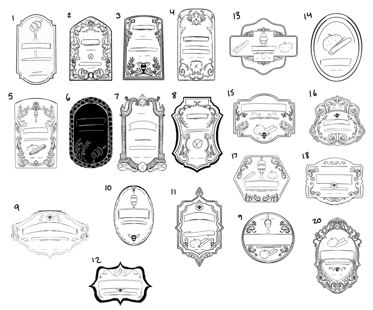


Digital Drafts
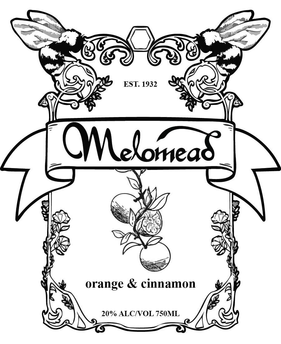


Final Designs


Mockups


Reflection
In the end, I felt like reworking the project was the right decision. I think the second time around, I was much more successful in fulfilling my original goals. During this project, I learned a lot about basic label design and evolved my Illustrator skills a ton, and I can confidently say I've gained experience that will help me in future projects. I definitely hit a good bit of roadblocks during this experience, but in the end, I feel happy with the outcome.