School Assignment
Date: December 2024
Deliverables: New Logo and brand, Advertisements, Signage, Merchandise, Website Homepage
Role: Primary Graphic Designer
Scope: Brand Identity, Advertising and Marketing, Merchandise Design, UI Design
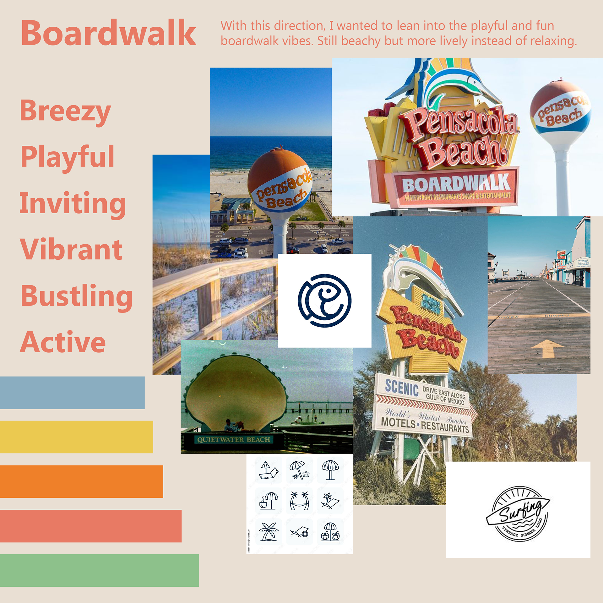
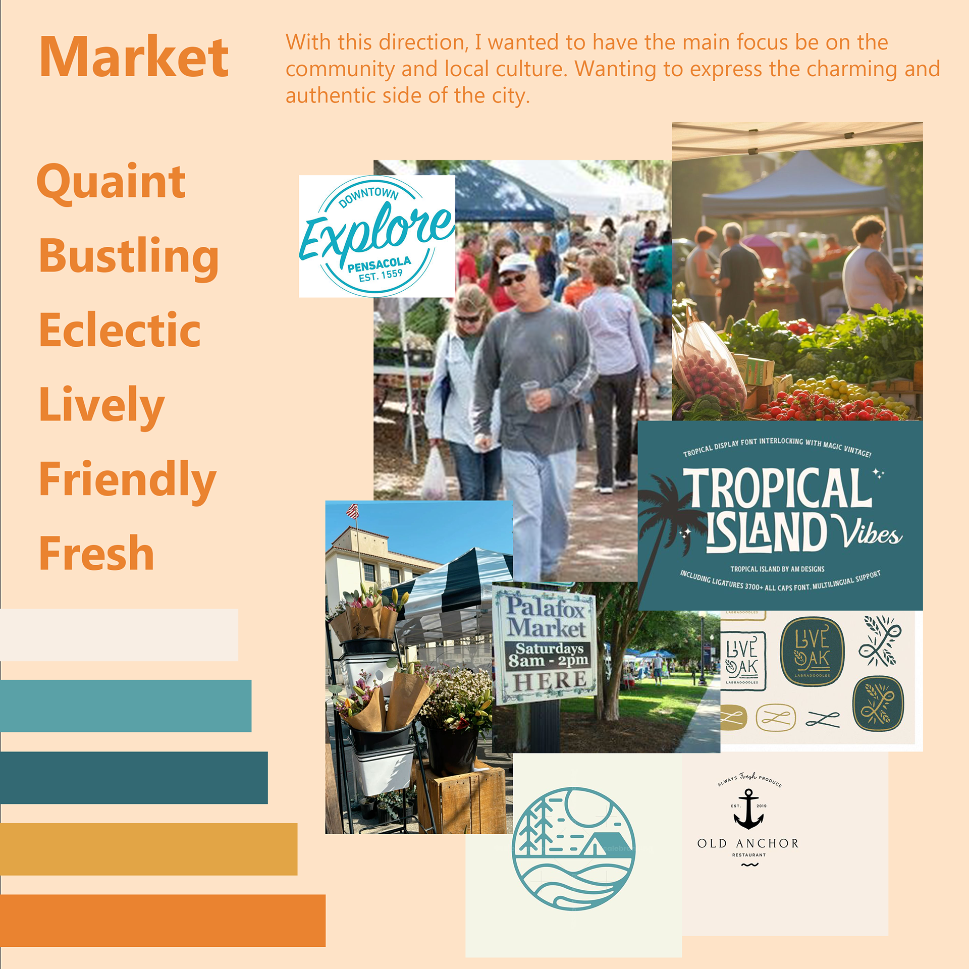
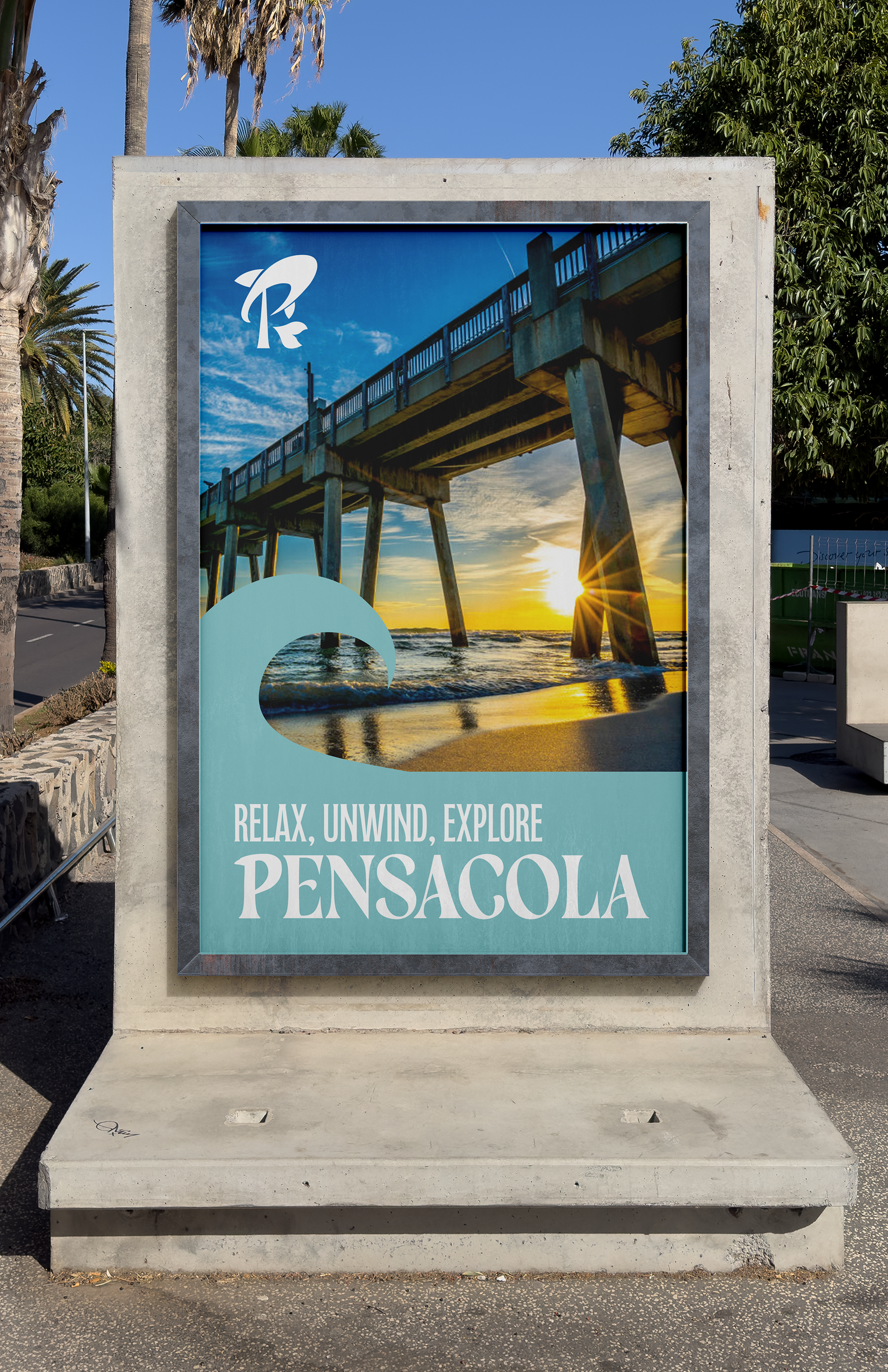
Located in Florida’s panhandle, Pensacola is surrounded by more than 50 miles of coastline, featuring the emerald-green waters of the Gulf of Mexico and crystal-clear bays. This unique setting creates a perfect balance between a laid-back beach town and a vibrant metropolitan center. Combined with its temperate climate and welcoming, success-driven community, Pensacola offers an exceptional quality of life.
This project focuses on the challenge of rebranding the city of Pensacola. It was important to capture the area’s many strengths while also appealing to potential visitors. The goal of the campaign is to establish a clean, modern brand identity that feels both fun and relaxing, reflecting the spirit of the city itself.
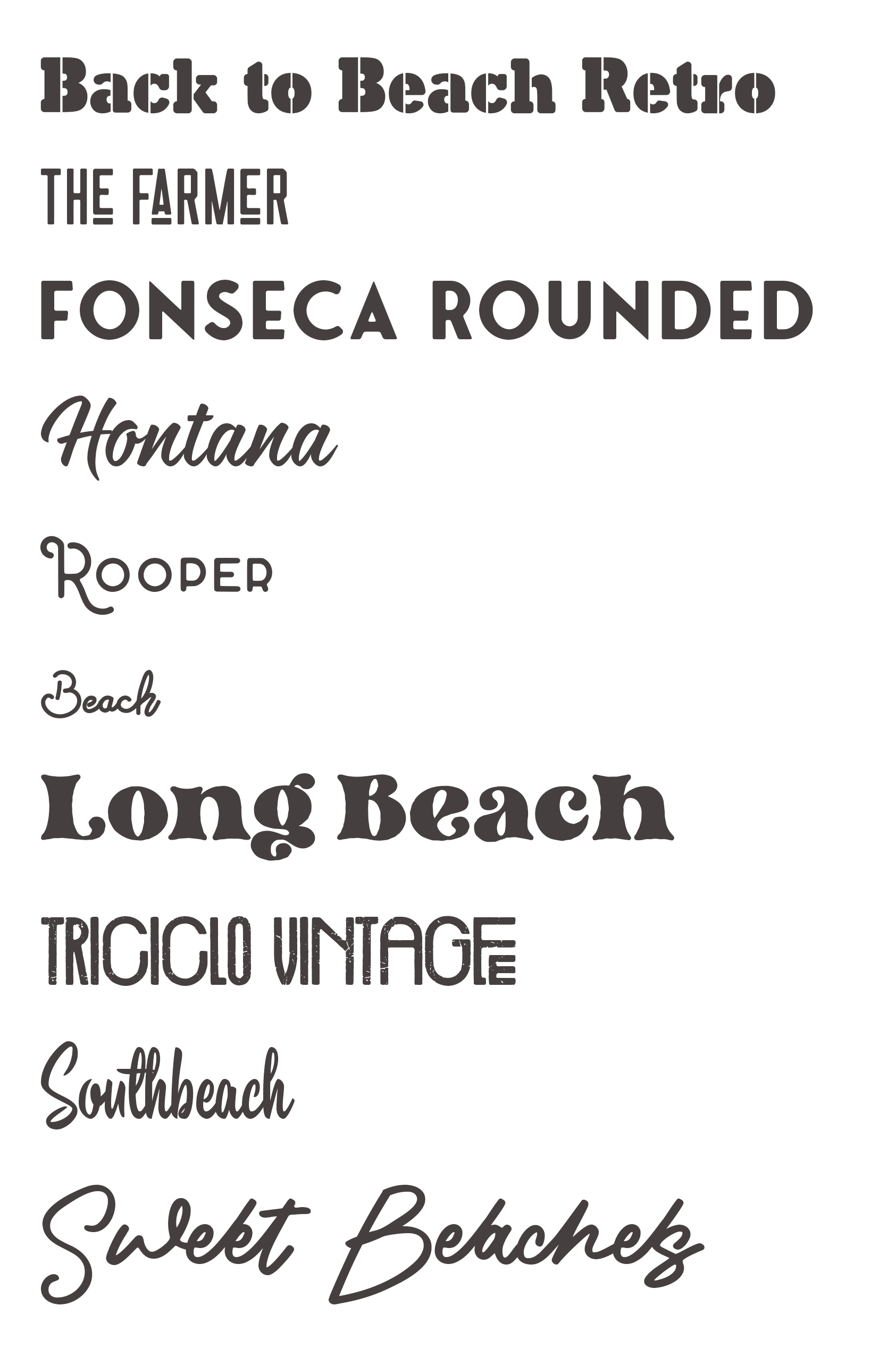
Process


Final Designs


Icon Development
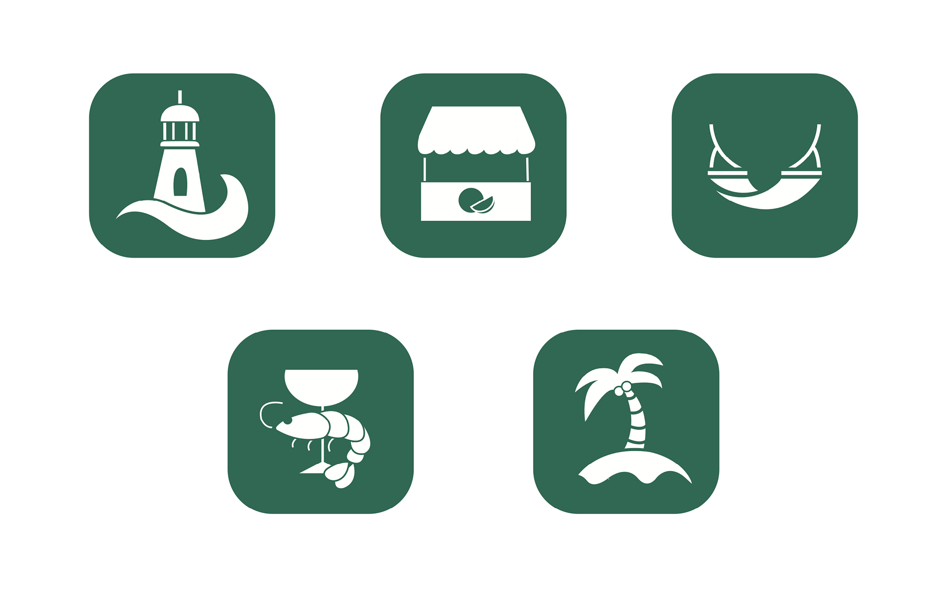
For this project, we also had to come up with a set of symbols for signage. The goal was to create illustrations that could be understood by anyone, no matter the language barrier. The symbols I felt were most important for tourists were, historical landmark, dining, market, beach, and lodging.


Mockup Sketches
For my mockups, I needed a lot of different assets for my branding campaign. Below you can see my original sketches for a poster, banner, billboard, website homepage, signage, and merchandise.

Mockups


Reflection
This project is absolutely one of my favorites and I feel like I gained a lot of useful design knowledge throughout the process. I got to design a homepage for the first time, allowing me to learn a new design tool (Figma), as well as learn the basics about accessibility on web and having to deal with proper contrasts and usability constraints. Overall this was one of my favorite projects, the logo is one of my favorites I've made! I feel that I was successful in creating a brand that reflected Pensacola perfectly, and achieved keeping it cohesive throughout all the different deliverables.