School Assignment
Date: May 2024
Deliverables: Logo, Advertisements, Merchandise
Role: Primary Graphic Designer
Scope: Brand Identity, Advertising and Marketing, Merchandise Design
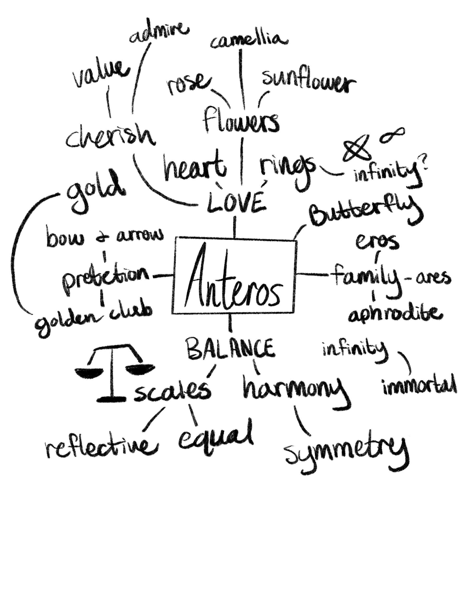
Anteros is a modern day penpal service whose goal is to promote and romanticize the historical action of sending letters in order to make and retain meaningful relationships. Based on the Greek god Anteros, god of requited love, this service strives to break away from text only culture and wants to be seen as modern and romantic with a focus on stationary and vintage themes. The main problem is being able to create a brand that’s both modern and nodding at a vintage time.
Process


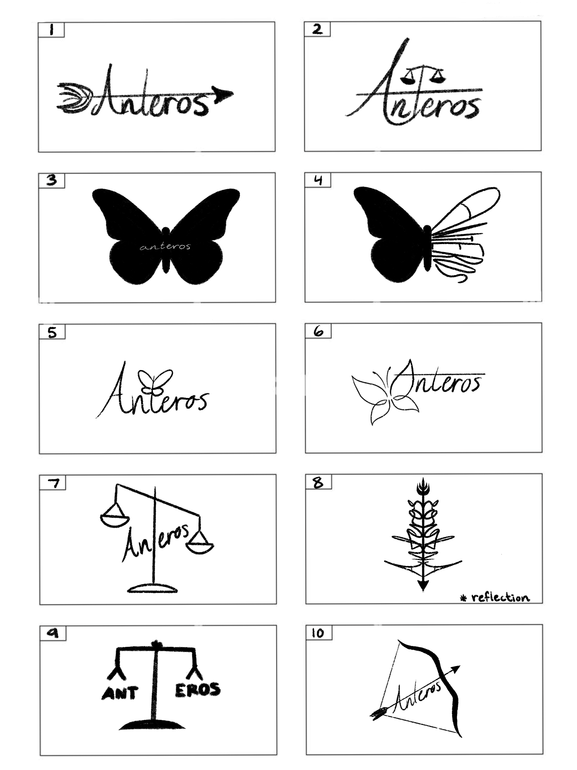


Final Logo


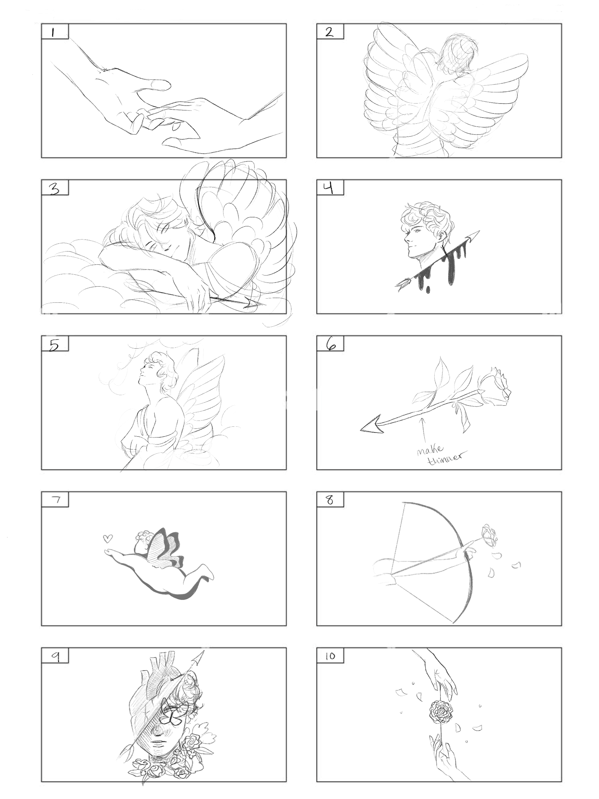
Mockups


Reflection
This project ended up being a really enjoyable one. Because I’ve always loved Greek mythology, I felt genuinely invested in the process from the start, which made the creative decisions feel even more meaningful. Throughout the project, I was able to deepen my understanding of how advertisements function and how important it is to maintain a strong, consistent brand identity across different platforms. I learned how elements like typography, color palettes, tone of voice, and visual motifs all need to work together to create a unified message that audiences can immediately recognize. Seeing my brand come to life in the various mockups was especially rewarding. It gave me a clear sense of how cohesive branding can strengthen the overall impact of a concept and make it feel polished, intentional, and believable.